Visualization of Collection Data
This is a work in progress that I am presenting at the RBMS Digital Special Collections Discussion Group at ALA Midwinter in Atlanta. The most current version of the visualization can be accessed at my Tableau profile. This page contains more information about the tools and techniques I used.
[slideshare id=71206647&doc=visualizingcollectiondata-170120041536]
Right now, I’m working primarily with collections of books and graphic materials that are cataloged, so that is going to be the basis of the data I’m going to present.
Some background first: my job in Special Collections is pretty evenly split among instruction, outreach, and digital projects, and I’m always looking for ways to integrate all three. I’ve been working on this project for a while, because I’ve long had the suspicion that the faculty and instructors we work with aren’t really interested in searching the catalog to find materials to use in their instruction. I welcome their questions, but at the same time, I know that it’s better if they can find inspiration for their teaching on their own, instead of relying on me as a middleman. A survey we did at the end of this semester confirmed that; about half rated the catalog and finding aids as not applicable to their teaching experience. So I am looking at this visualization as a gateway to the catalog for them, a communication tool, not a catalog replacement.
My first step was to pull all the records for catalogued materials in Special Collections using Create Lists in Sierra. I isolated only the location codes I wanted to analyze, which in this case was anything with an item-level record. Slide 3 (in the embedded SlideShare above) contains a list of the fields I included in the export file.
The problem with my export file was that it contained multiple items on the same rows, and rows had differing numbers of records. So I had to do some clean-up. This was really the most time-consuming part of the process. Starting from the last column in the dataset, I sorted the spreadsheet to group rows with the same number of columns.
From there, I needed a way to split those multi-item rows so that each item was on its own row. In order to do that, I ended up customizing an Excel macro from ExtendOffice.com. Just in case anyone else runs into this problem, you can download it below, and there are instructions on how to use it in the file.
Download my Split and Stack Excel file with macro (zip file)
I wanted to visualize this data in two ways: with word clouds that would give an overall impression of what the collection’s strengths are, and with an interactive browsing tool. So I chose Voyant Tools and Tableau Public.
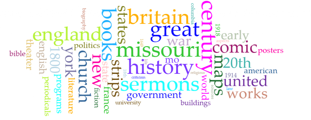
Here’s how the word cloud of all the titles in the collection turned out.

And this one is all the subject headings.
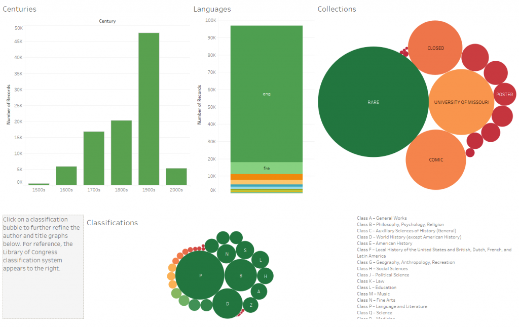
I actually didn’t get quite as much detail as I’d hoped from these visualizations, about the way various collections relate to each other, so I tried to set this up in Tableau. Below is a quick look; click on the image to be taken to the actual dashboard so you can play with the data.
So far, I have only had Special Collections staff and some of my Facebook friends test this, so I am very interested in any feedback you might have!
 Previous Post